Real estate professionals pulled no punches following the unveiling Monday of the National Association of Realtors’ first new logo in 45 years — a three-dimensional blue cube that members overwhelmingly panned, calling it overpriced and uninspired.
With the exception of scattered positive reviews, the new logo conceived by the Conran Design Group at an estimated cost of $250,000 drew swift disparagement on social media and in comments under an Inman report announcing the rebranding.
“It took 45 years to come up with that?” wrote Tom Grisak, of the Grisak Group in Texas, in a comment on the original Inman story. “They could have spent $45 with Fiverr and had a design that looks both classy and professional.”
“Really don’t know how to react to this non-redesign of a design,” added Linda Hoverman O’Neal, a real estate agent at Re/Max Metro Realty in North Carolina. “What’s the point?”
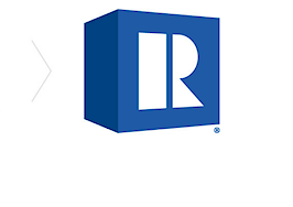
The logo, the familiar “R” printed in a bold sans-serif typeface called Montserrat, rises from the page on a cube tilted to the right embellished with two shades of blue — the lighter called Pantone 293C, and the darker Pantone 288C. The concept is meant to convey the group’s new dimensions and depth, including a renewed focus on members, NAR CEO Bob Goldberg said.
“Dynamic and future-focused,” in the parlance of a press release, the contemporary blue logo will roll out to more than 1,200 state and local associations in June and subsequently make appearances on everything from business cards and real estate signage to promotional pins.
But in a poll posted by the Facebook group Raise the Bar in Real Estate, 113 of 159 respondents rated the logo a zero, a one or “Hire a new marketing agency” on a scale of 1-10.
“What a way to spend members membership money,” wrote Hector Reyes, a sales specialist at Neighbors of Hope New Realty in California who weighed in on the Facebook page Monday.
Teresa Boardman, a Minneapolis-based broker, told Inman on Monday that she has no plans to change her signs or business cards when the rollout begins later this year, or by December 2019, when members are expected to incorporate the new logo.
“I am not a fan,” she said. “It was a simple, easily recognized logo. They fixed it even though it wasn’t broken.”
“NAR has not changed,” Boardman added. “It will take a lot more than a new logo.”
Virginia-based Realtor Karen Close, however, cheered the new logo, calling it “modern.”
“I like it,” she said in a comment under Inman’s story. “It’s no big departure from the old one (which has been ingrained into the psyche of consumers for the last 40-odd years, retaining the investment made in promoting the brand); yet it’s new and much more modern looking.”
“I just wish they would have hired me to do it,” she added. “Couldda used a quarter mil.”
Justin Wright, a senior designer with the National Hockey League, said NAR’s move to evolve its “wordmark,” or typographic treatment of the brand, to a more inviting font is similar to recent changes made at Walmart, Microsoft and Mastercard.
“What we see in the NAR rebrand is something commonly referred to in the design world as a brand ‘refresh,’” Wright said. “It’s not a radical departure from the existing brand, but rather an evolution. The refresh approach can be quite successful, especially for a brand with as much equity as the National Association of Realtors. It allows a company to build off the core assets of the current brand and (when done well) communicate those elements in the truest of forms.”
Dustin Longstreth, the chief strategy officer at CBX, a branding agency with offices in New York City and Minneapolis, said the $250,000 price tag seems appropriate. With so many vested interests, it’s not a simple change. The process starts with stakeholders, who determine the message they want to convey. It then involves a range of ideas before the focus is narrowed.
“I know that seems like a crazy amount of money, but it can become a downward spiral when you’re not investing in your brand and your look and identity,” Longstreth said. “Membership goes down. Your ability to attract talent or provide the benefits that you’re looking to provide to your constituency become diminished if you’re not investing in your own brand.”
“Brands that never change are not classic,” he added. “They’re dead.”


