By Mitchell Parker; reposted with permission from Houzz
Many people have a general area or neighborhood in mind when searching for a home, but Houston engineers Brie and Scott Kelman knew exactly which street they wanted to live on. And they didn’t care how long it took to get there.
That’s why they spent more than two years with a watchful eye on the tree-lined stretch, even long after they outgrew their existing 1920 two-bedroom home when their first child was born and their second was on the way.
The reason it took so long was that most of the homes on Harvard Street in the Historic Heights neighborhood had been “redone weirdly or were too expensive if they were done well,” says Brie. Their luck changed when a builder friend mentioned a severely dilapidated house on the street that had recently gone up for sale. The Kelmans were in New Zealand at the time visiting Scott’s parents, but they didn’t want to miss the opportunity, so they put in a contract without ever stepping foot inside.
Houzz at a Glance
Location: Houston
Who lives here: Brie and Scott Kelman, both engineers in the oil and gas industry; their 2-year-old son, Oliver; and their 4-month-old daughter, Georgie
Size: 3,000 square feet (279 square meters); four bedrooms, three bathrooms
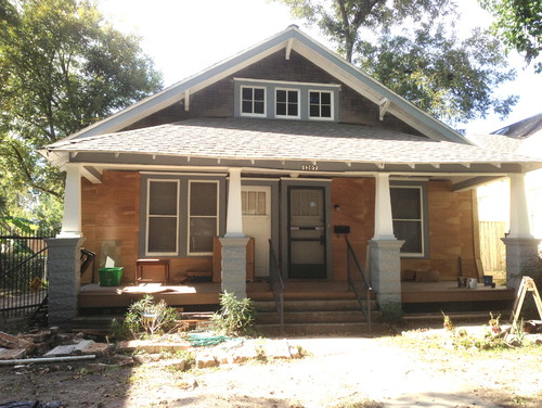
When they finally did walk in, the Kelmans were more than shocked. Water and mold had damaged the original wood floors and walls beyond repair. Makeshift plywood patches covered holes in the floor. Drywall had been put up on only a few walls, and even then, none of it had been painted. Plus, there was trash piled nearly knee high.
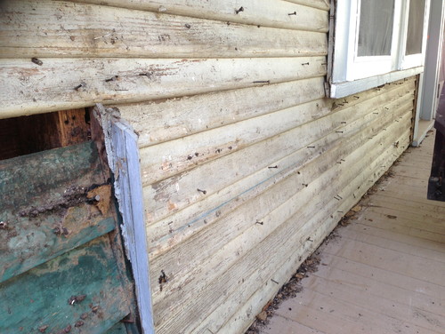
The home was built in 1920 as a three-bedroom, two-bathroom single-family residence. At some point during the past 94 years, it was converted into a duplex, then converted back to a single-family home. The two doors from its duplex days oddly remained. The cheap wood veneer on the asphalt roofing shingles, all nailed to the original teardrop siding, was crumbling off.
The Kelmans may have finally had their slice of the street, but it was by far the worst piece of the pie. “It was the only house on the block that wasn’t gorgeous,” Brie says. “But it was the only one I felt I could afford.”
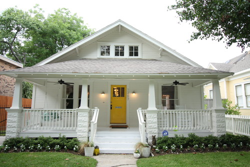
AFTER: Brie remained optimistic, and she and Scott, along with architect Sam Gianukosof Creole Design and builder Dave Seeburger of P&G Homes, got to work gutting the home. They also added more square footage to the back in the form of a new combined kitchen and great room, and a second-story addition with three bedrooms, including a new master suite.
Brie chose nearly every piece that went into revitalizing the home, from the plumbing fixtures to the dressers, using images she found on Houzz as inspiration.
With a full-time job as an engineer, and with a toddler already and a baby on the way, Brie squeezed in time hunting for pieces for the home during her lunch break and on the Internet at night. “I had over a year of planning, and when I’m pregnant I can’t sleep very well, so I’d wake up in the middle of the night and get on Houzz,” she says. “Even if I hired someone, I’d end up doing it myself, because I’m such a bargain hunter.”
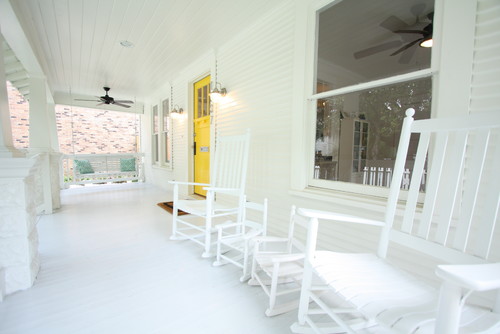
She did hire a designer to help choose the exterior white paint color and the front door color. While trying to figure out a color at a Sherwin-Williams paint store, she ran into designer Stacie Cokinos, who offered to help. “I hired her for $65 an hour, and she came over with a box of paint samples and talked through some options,” Brie says. “I was worried about choosing all white, because I was afraid of being too boring. But every house I love is always all white, and Stacie gave me the confidence to go with my gut.”
At the time the doors weren’t ready, so Brie couldn’t test the color, but by that point she was used to making quick decisions. “I was very pregnant, and one of the yellows was named Cheerful, so I just said, ‘Let’s do that,’” she says.
The Kelmans removed all the nails and restored the original teardrop siding.
Despite its haggard appearance, there was plenty that Brie loved about the home. Walking through, she noted two old claw-foot bathtubs and a sink that she could reuse, and several original five-panel doors.
She found this particular bathroom layout odd. “It was like,bam — tub, sink, toilet all in a row,” she says. “Not to mention the mold covering the walls.”
AFTER: The interior was completely gutted, and the floor plan was completely changed. The more open layout stems from Brie’s hatred of hallways. “I feel like they waste square footage,” she says.
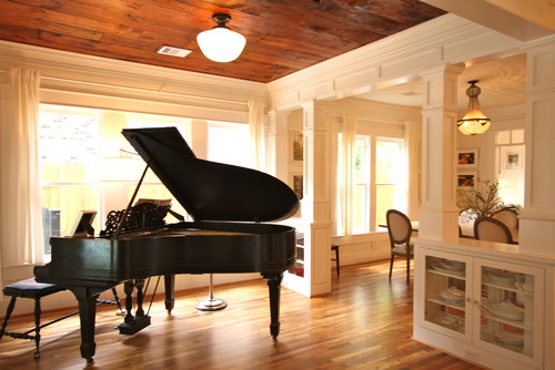
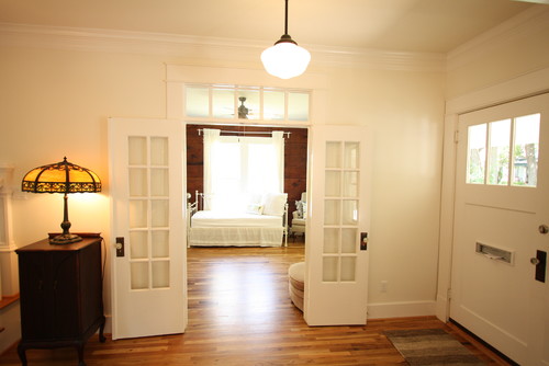
From every place she stood in the house, Brie wanted to be able to see shiplap, transom windows and old light fixtures. The view from the entryway looking into the piano room and dining room accomplishes that.
The piano is a Steinway from 1886 that once belonged to Brie’s grandmother. “It’s very special to me, and I wanted to have that be the first thing you saw when you walked into the house,” she says.
Be a Bargain Hunter and Refinish Rather Than Replace Furniture
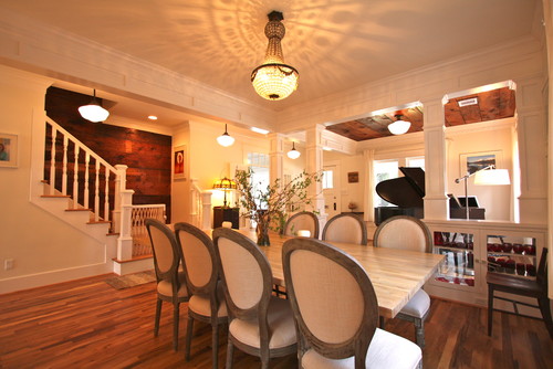
Headers in the ceiling and half walls with see-through storage helped her achieve some semblance of separation. “Even though I don’t like hallways, I like the division of space,” she says.
Brie knew she loved all-white homes but struggled with choosing it as a color scheme for fear it was too basic. In the end she was happy with her choice. “You forget how it accents the old wood and floors,” she says.
Almost all the lights in the home are schoolhouse-style fixtures, Brie’s favorite.
“My husband’s an excellent cook, and we have a lot of dinner parties, so I knew I wanted a big dining table that could seat 10,” Brie says.
She found an antique industrial crank base from an antiques dealer and had a 48-inch-wide by 8½-foot-long top made from red and white oak. The top originally had a clear coat that was too similar to the floor for Brie’s taste. “I got a sample in the mail, and it was just too matchy-matchy,” she says. To get some variation, she had the tabletop bleached twice and sealed with polyurethane.
She wishes they could have saved the original floors, but they were unsalvageable. She added solid white oak hardwood. “It’s the next grade up from the cheapest,” she says. “With an all-white home, I wanted something with lots of dimension and texture, and this has good knots and color variations.”
She paid $5.85 per square foot for the floors, including labor and materials.
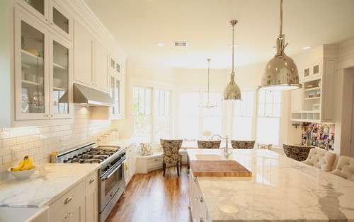
Brie based the design of the kitchen, located at the back of the house, on a photo she saw on Houzz from Pickell Architecture that had a bay-window breakfast nook and an all-white color scheme. (Brie communicated with Pickell through email to request the dimensions of the island to make sure hers would work.
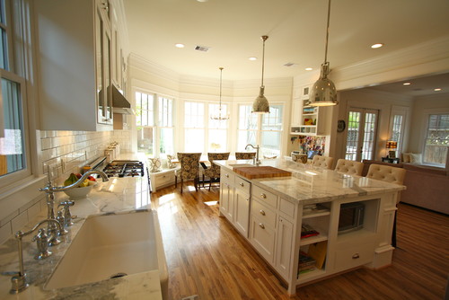
She initially balked at the idea of putting her microwave under the island, but then realized that it’s a great way to hide an “ugly appliance that I rarely use,” she says. “Plus, my kids can heat stuff up for themselves as they grow.”
Again, choosing the white scheme gave her pause but didn’t stop her. “A lot of people love white subway tile, but when they go to choose it, they change their mind because one little white tile looks so boring, but they forget about how the grout lines add dimension and it’s timeless,” she says.
A cutting board from Williams-Sonoma acts as the main food prep area, because Brie wanted to preserve the Calacatta marble counters. “I’m petrified of screwing up the marble, so we put everything on that board,” she says. “It’s a practical solution to the impractical choice of having marble with two small kids.”
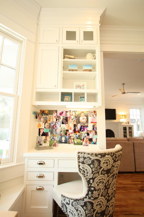
Brie says she combined ideas from about four photos she found on Houzz to create the built-in desk and storage unit in the kitchen. Using her iPad, she showed the photos to her carpenter, Felix Vargas of P&G Homes, who drew out the dimensions on the wall and then built the unit.
Brie saw a cutting board drawer in her friend’s in-laws’ house and had to have one. “I took a photo of it on my iPhone and showed it to my carpenter, and he built it,” she says. A pullout trash can drawer lets whoever’s prepping a meal scrape leftovers easily away.
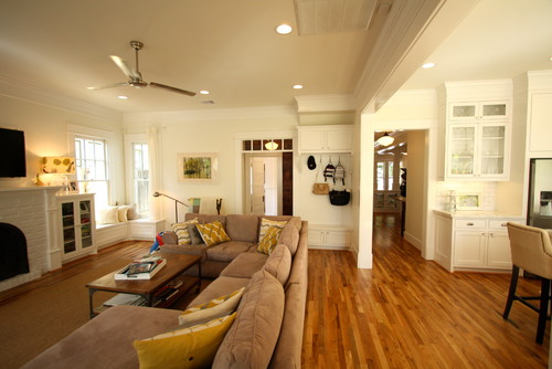
Growing up, Brie had a good friend with a ranch in Kansas City that had a kitchen and living room open to each other. She wanted the same for her home. “Even though it was a little ranch home, everyone could end up together,” she says.
To gain square footage, they removed the back wall of the house and bumped it out nearly 7 feet to accommodate the new great room and kitchen. “We wanted to keep as much yard as possible, because my husband grew up on a farm in New Zealand and likes to have his veggie garden,” Brie says.
Find the Perfect Dining Set for Your Dinner Parties
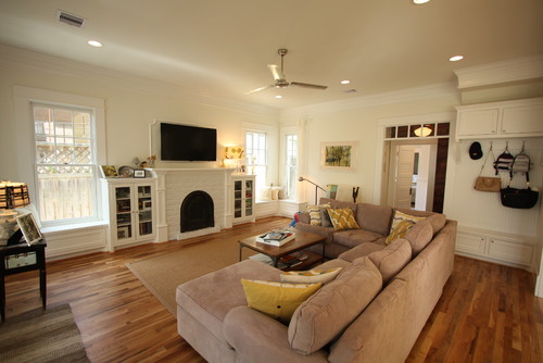
The sofa was Brie’s first purchase as an adult. “I paid $1,000 for it, and it’s been with me to seven different places,” she says.
The fireplace is fake. Scott says that growing up, his only source of heat was a fireplace, which he had to clean all the time. So now he associates them with too much work. But since Brie wanted a mantel to hang Christmas stockings on, they found a compromise.
Brie wanted antique tiles for the surround but didn’t want to pay the $30 to $40 price per tile she was quoted. She saw a photo on Houzz of old bricks being used and re-created the look with ones that say Houston and Harris County. These she painted a light gray. “It’s a running joke that this is my accent color to all the white,” she says.
Brie couldn’t get a mudroom near the entryway, so she had her carpenter put something similar in function in a leftover corner of the great room. She says that since the architect tried to avoid locating bathrooms right off other rooms, he designed this vestibule, which the Kelmans then outfitted with an antique bar.
French doors from a local architectural salvage shop lead to the guest room/study to the right of the entrance.
Brie looked into getting wooden blinds, but after taking measurements, she couldn’t find anyone who could get them to fit. She then considered plantation shutters. “But those would have been horrifically expensive,” she says. “They quoted me $7,000 for just 12 windows on the front. And that was from Home Depot.” Instead, she bought curtains, rods and end knobs for the entire house for $800 from Home Depot.
The chair was a $300 purchase from a traveling antiques show.
After the kitchen, great room, dining room, guest room and piano room were planned, the Kelmans ended up with a much larger leftover space for the guest bathroom than they had anticipated.
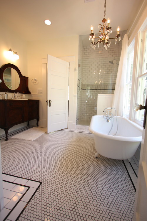
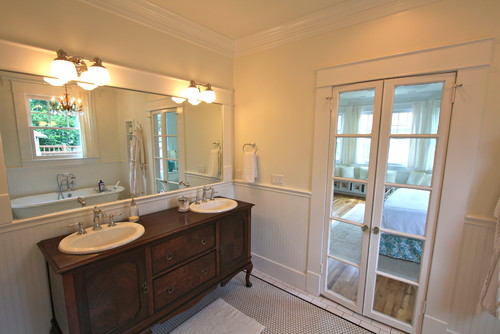
The tile style and pattern — hexagonal mesh tiles and skinny black subway tiles with black grout — came from various photos that Brie found on Houzz and shared with her architect and tiler. All the vanities in the bathrooms were dressers found at antiques stores; Brie had her carpenter cut holes in them for sinks.
This is one of the original claw-foot tubs that was left behind in the old house. Brie had it refinished for $575.
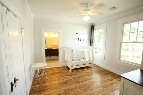
The new second-story addition provided the Kelmans with a room each for their son and daughter.
The nursery and Oliver’s room are painted in light gray; they’re the only two rooms in the house that aren’t white.
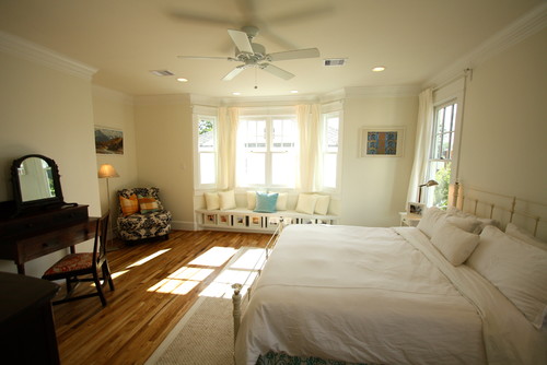
Brie based the master bedroom’s bay window off another photo she found on Houzz. The architect had planned for a TV cabinet in the corner, but Brie didn’t want a TV in the space, so she created a reading nook instead.
Transform a Room With a Splash of Yellow
Brie, who is 5-foot-9, sprang for a 72-inch vintage tub from a local antiques store. “When I was pregnant, I didn’t fit in the tub we had,” she says. “Everyone fits in this tub.”
The architect located the shower knobs on the small half wall just inside the shower door so the Kelmans wouldn’t have to get wet when turning them on.
Built-in cubbies, Brie says, were less expensive than building a ledge.
Here’s another antique dresser that was converted into a vanity.
When the local historic commission forced the Kelmans to push their second-story addition back a foot and a half, they ended up with a weird space in their closet. Brie saw a photo on Houzz of a shoe rack and added similar ones.
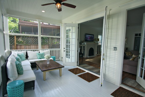
The great room opens to a screened-in porch in the backyard. Brie says she found the shiniest paint she could find at The Home Depot, because it cleans up more easily. She had her carpenter cut the legs off her old dining table to create the coffee table.
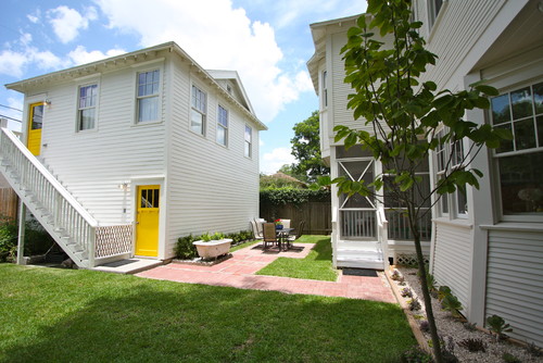
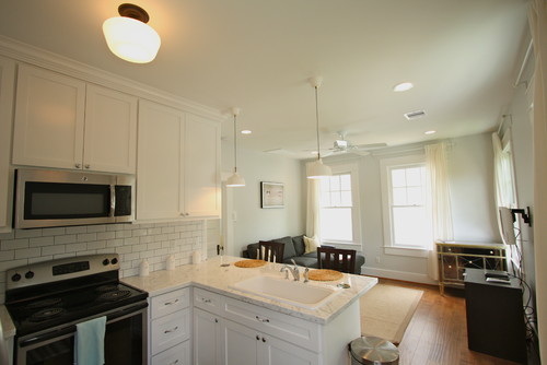
Brie says her in-laws were always self-conscious about intruding, so the Kelmans had an apartment built above the garage.
The all-white scheme continues in the one-bedroom apartment.
Brie had the other claw-foot tub placed in the backyard. They use it mostly for holding potted plants.

