By Becky Harris; reposted with permission from Houzz
This family’s 90s Mediterranean-style home outside Miami was looking tired. After seeing what the design team at DKOR Interiors had done for friends in the same model house as theirs, the family hired the team to update their home.
Of course, they didn’t want a carbon copy of their neighbors’ renovation — they had their own needs and style. In addition to wanting to transform their home into something more contemporary with cleaner lines, they needed to incorporate design elements relating to their faith and keeping their home kosher.
Houzz at a Glance
Who lives here: A married couple and their five children
Location: Aventura, Florida
Size: 4,500 square feet (418 square meters); six bedrooms, six bathrooms
Before pencil hit paper, DKOR principal Ivonne Ronderos sat down with the couple to go over their requirements: lots of storage for the china and glassware needed to keep kosher, two sinks and two dishwashers and, tucked into the dining room, a small sink for washing their hands. “Both of these homeowners love bold design that’s simple and clean,” she says.
After studying how the clients needed their home to function, the DKOR team pulled together a unifying design concept that suited the space. By playing with large expanses of wenge wood, specialized lighting and clever recesses in the drywall, they emphasized architectural volumes. It takes a second or third glance to realize why ceilings appear to float, where some of the storage is hidden and why even with all of these clean lines, nothing seems flat.
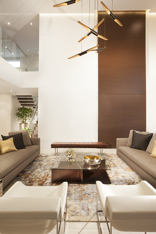
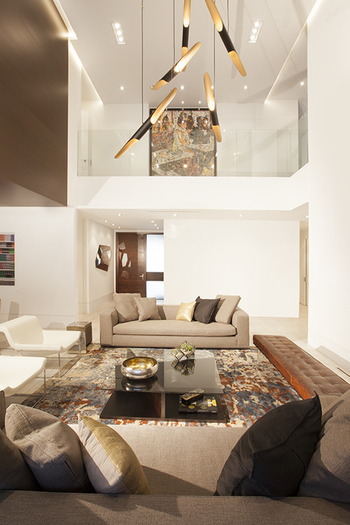
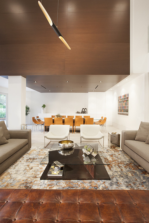
“Designing the room was tricky because of the high ceilings,” says DKOR design team member Margaret Smith. The design challenge presented by the two-story ceilings in the living room inspired the idea of emphasizing architectural volumes and using them to delineate different areas. Large pieces of wenge wood stand up to the scale of the room.
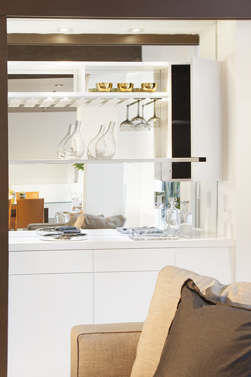
The bottom piece of wenge here slides open to reveal a bar and glassware storage. “The homeowners wanted all of the storage to be very concealed and built-in,” Ronderos says.
Browse Thousands of Pendant Lights
With its white cabinetry and shelves and mirrored wall, the bar is unobtrusive even when the wenge wood door is open.
The designers hung a handful of pendant lights at different heights to create a mobile-like chandelier. It draws the eye up and fills the room’s volume.
Lighting played a big role in the design. “We used lots of drywall at different planes to create different depths and to connect solids with voids,” Ronderos says. For example, the reveals along the ceilings add shadows and draw the eye up.
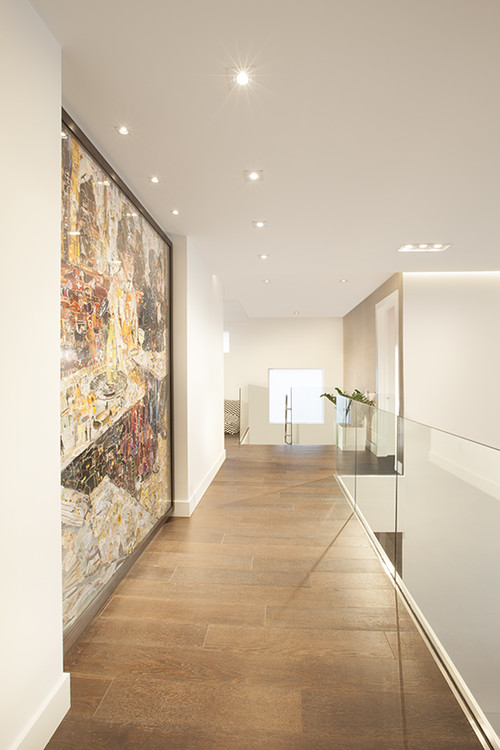
Also drawing the eye upward is a large-scale piece of artwork upstairs that can be enjoyed from below. From afar the piece is the figure of a lady in a café. Up close, it is a collage of books, magazines and other materials. The designers created a niche for the homeowners’ beloved piece that plays off the architectural volume theme and enhances the artwork’s presence. Subtle LED lighting illuminates it.
The original windows were arched, and there were French doors. The designers resized them and gave them clean, rectilinear forms. Their scale and shape stand up to the scale of the large wenge wood pieces.
Inspired by the gold trend they saw at this year’s Milan Design Week, the team mixed in gold metal accents. “Mixing metals gives a space a very modern sensibility,” Ronderos says.
In addition to the gold and silver, they accentuated the neutral palette with warm colors. “Both of the clients like fabrics with a masculine feel, like the leather on the bench, and Hermès burnt orange hues,” Ronderos says. The silk area rug changes in lightness and color as you walk around it. The linen sofa is durable and can stand up to children.
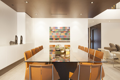
Wenge wrapping the walls and ceiling creates the illusion of a giant cube over the dining room.
“We played a lot with geometric shapes, mixing things like the cubed planter and the X coffee table base with softer elements like the silk area rug,” Ronderos says.
More of the burnt orange color turns up on the artwork and the chairs in the dining room. The dining table grounds the room in dark wood, while the ceiling creates a more intimate-feeling space.
In the dining room, a 15-foot-long cabinet cantilevers off the wall and stores more of the china and glassware.
Complement Dining Room Artwork With Colorful Chairs
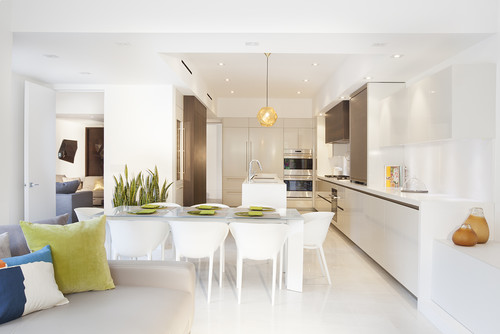
The family gathers for more casual meals in the kitchen, where copious amounts of white are accented by more wenge wood and pops of chartreuse. Again, architectural volumes dominate the design. The kitchen island appears as one long block punctuated by two sinks. The large panel on the left is a functional architectural feature — its little bump-out houses the concealed bar in the adjacent room.
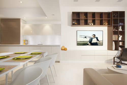
The tall appliance garage (left) conceals an unsightly structural column. The kitchen contains lots of storage that looks simple on the surface, like this cabinetry. The simplicity helps make the transition from the kitchen into the cozy family room seamless. Note how the waterfall countertop connects the kitchen counter to the built-in family room media console.
The team used the same finishes and carpentry in both rooms. Wenge cubbies continue the geometric play. Durable fabrics and materials were used in this room designed for kicking back in; the coffee table is outdoor furniture.
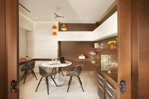
Everyone in the family uses the small study on the main floor. “This room shows the architectural volume concept very well,” Smith says. Different depths are explored with the storage cabinets. Lighting recesses around the ceiling make it appear to float. A smaller mobile-like light fixture adds a playful touch on the ceiling.
In the tiny powder room, a backlit floor-to-ceiling mirror and a simple Corian shelf with the sink carved into it make the space feel larger. To the left, a hidden cabinet provides storage for extra rolls of toilet paper and cleaning supplies.
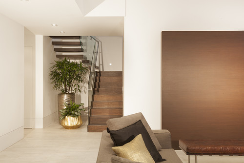
Oversized planters continue the metal mix and soften the strong, clean lines of the stairway. Twelve-inch recessed baseboards are another subtle detail and create continuity throughout the home. The detail even continues on the white doors.
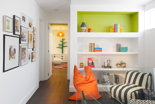
At the top of the stairs is a comfy loft for the kids. Recessed shelves look like they are carved into the drywall. A pop of chartreuse brightens things up, and a gallery wall of family photos adds a personal touch.
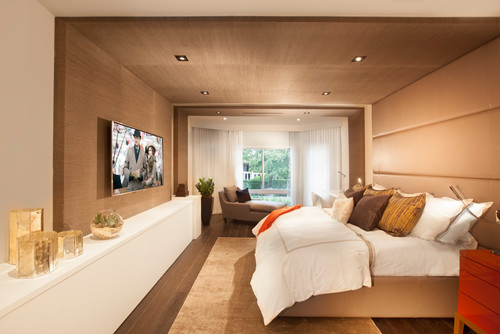
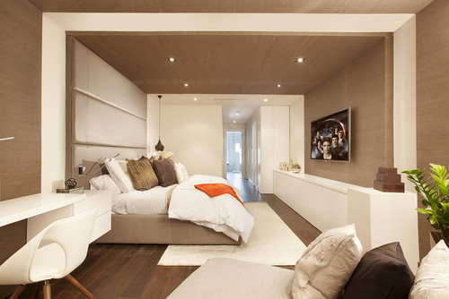
Upstairs, the team divided the master bedroom into two distinct sections. In the sleeping area they wrapped the walls and ceilings in grass cloth.
Past the bed is a sitting area complete with built-in desk. “The long built-in cabinet is very architectural and plays with depth,” Ronderos says.
Houzz Tour: Deceptively Detailed Minimalism in Miami
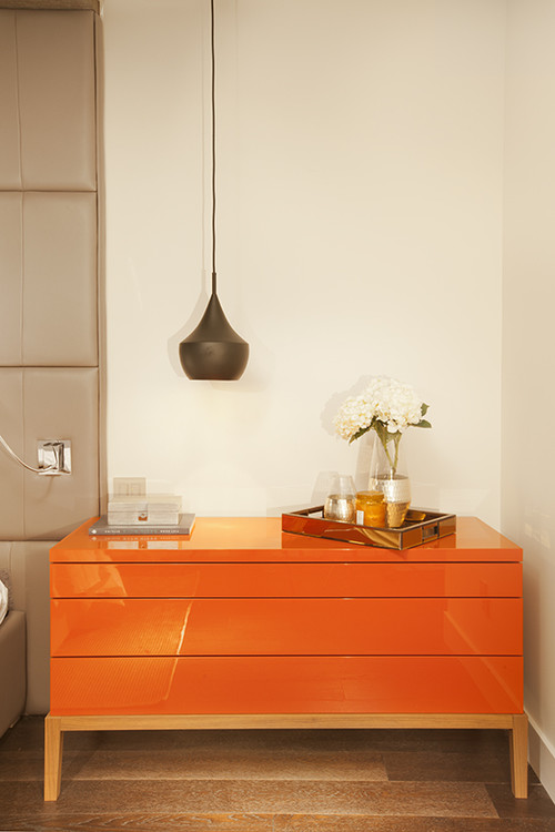
The warm Hermès orange turns up in a shiny lacquered cabinet.
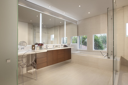
In the master bathroom, the tile continues from the floor up the tub surround and the wall, creating a seamless effect. LED lights are integrated into the mirror.
Designer trick: The tile extends over just enough of the top of the windows to conceal roller shades, maintaining the minimalist look.
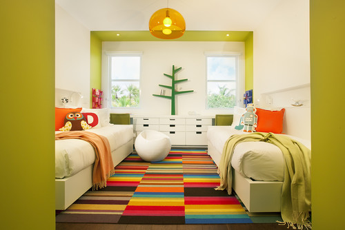
Flor tiles energize this kids’ room, shared by a 3-year-old and a 5-year-old. Recessed niches with Corian surfaces continue the architectural volume theme and provide space for books and lights. The designers wrapped the desktop and storage area in chartreuse.
“The cabinetry is all Ikea, topped with Corian,” Ronderos says. “It’s a really economical way to create a fun feature in a kids’ bedroom.”
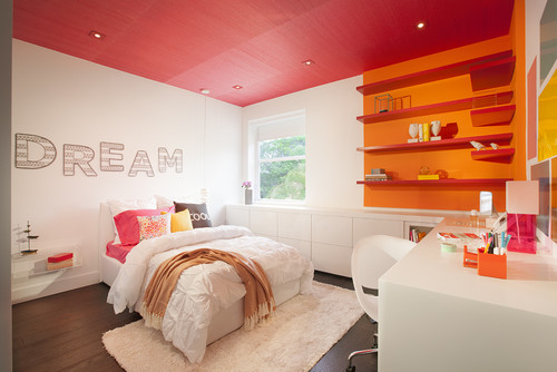
In one of the kids’ rooms, the ceiling adds big color, thanks to another Phillip Jeffries textured wall covering. The team had the recessed light surrounds and Ikea shelves painted to match.
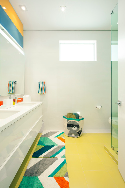
The designers kept the other bathrooms simple and minimalist, adding color with accessories and one or two splashes of color. In this one, it’s chartreuse on the floor tile. The cabinetry is Ikea, the textiles are from Target, and the raccoon comes from The Land of Nod.
“These homeowners are all about spending time together as a family,” Ronderos says. While the rooms have a very sophisticated look, they were designed for the whole family to feel comfortable using them.

