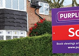
The U.K.-based flat-fee brokerage Purplebricks has unveiled its new logo.
The logo, which features the company’s name in white text enclosed in brackets, replaces a previous insignia entwined in bricks, a play on its name.
A Purplebricks spokesperson confirmed that the new logo will be used for the company’s UK, US and Australian branches.

New logo on the left, old logo to the right.
While real estate companies frequently revamp and modernize their logos, the real estate industry at-large, and the consumers they serve, often have passionate opinions about these design adjustments.
Earlier this year, the National Association of Realtors paused the rollout of a new logo — the first such redesign in 45 years — after a vocal backlash from some of its dues-paying members, who balked at the price of the revamped three-dimensional design, which came in at approximately $250,000.
In a Property Industry Eye article readers were mostly unmoved by the new Purplebricks logo, and they voiced their disapproval in the comment section.
“Well I guess when you get paid regardless of result you’ll have plenty of spare money lying around to spend on rebranding!” one reader wrote. “I’m sure all of their customers who got absolutely nothing for their money will be delighted?”
Others, however, saw the value in a rebrand. In February, Purplebricks found itself at the center of controversy after an industry analyst accused the company of hiding the true number of homes it sells through its flat-fee program — a claim Purplebricks has denied.
“Don’t underestimate rebrands,” one reader wrote. “They’re done for a reason and they take a hell of a long time to complete.”
What do you think of the new Purplebricks logo? Vote below:


